Agatha Christie’s first Miss Marple book, The Murder at the Vicarage, was published by Collins Crime Club in the UK in October of 1930. It’s one of my very favorite books – with its clever plot, humor, beautifully rendered characters and of course, the introduction in novel form of the subversive Miss Marple, it stands the test of time and has never been out of print. For that reason, it’s fun to look at covers through the years.
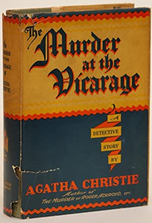 The US first edition of Vicarage was published by Dodd, Mead and is what I would think of as a “prestige” cover, with its old English font and decorous arrangement of text. There’s no art to speak of, no interpretation of the plot.
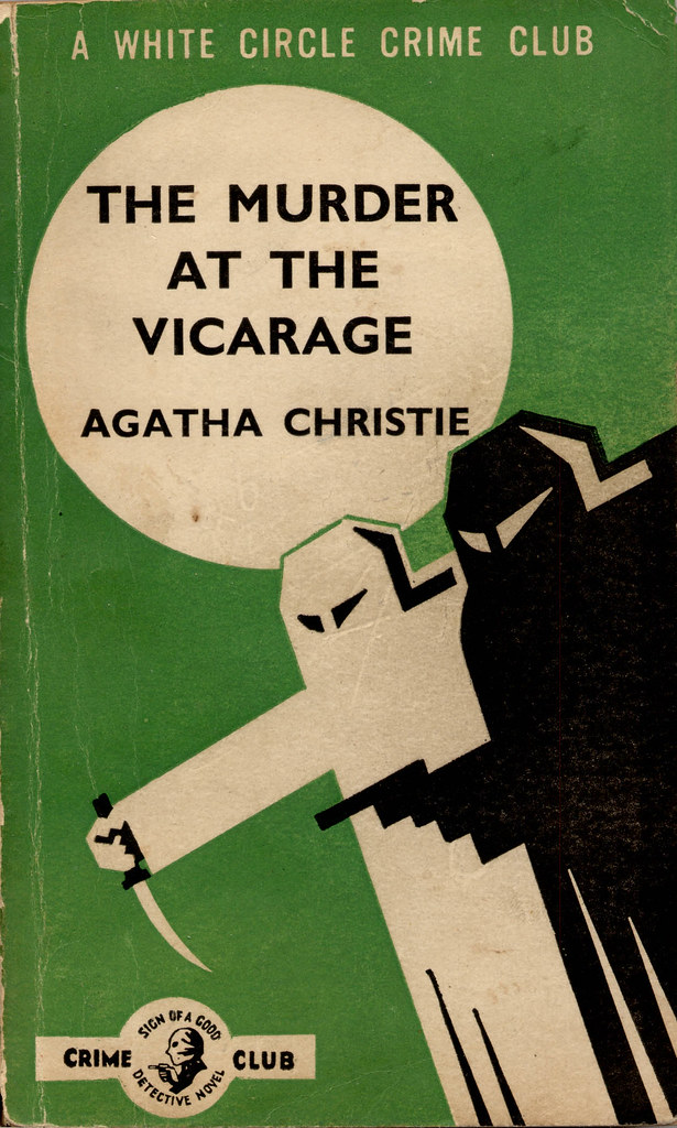
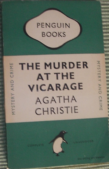 In 1947, White Circle (the paperback imprint of Collins Crime) published a puzzling green cover. The menacing black and white figures have little to do with Christie’s village mystery, much of it set, as the title implies, within the confines of the vicarage (though expeditions to gardens and tennis courts are taken). In 1948, Penguin put out one of their classic green covers, another in a line of what I think of as prestige covers.
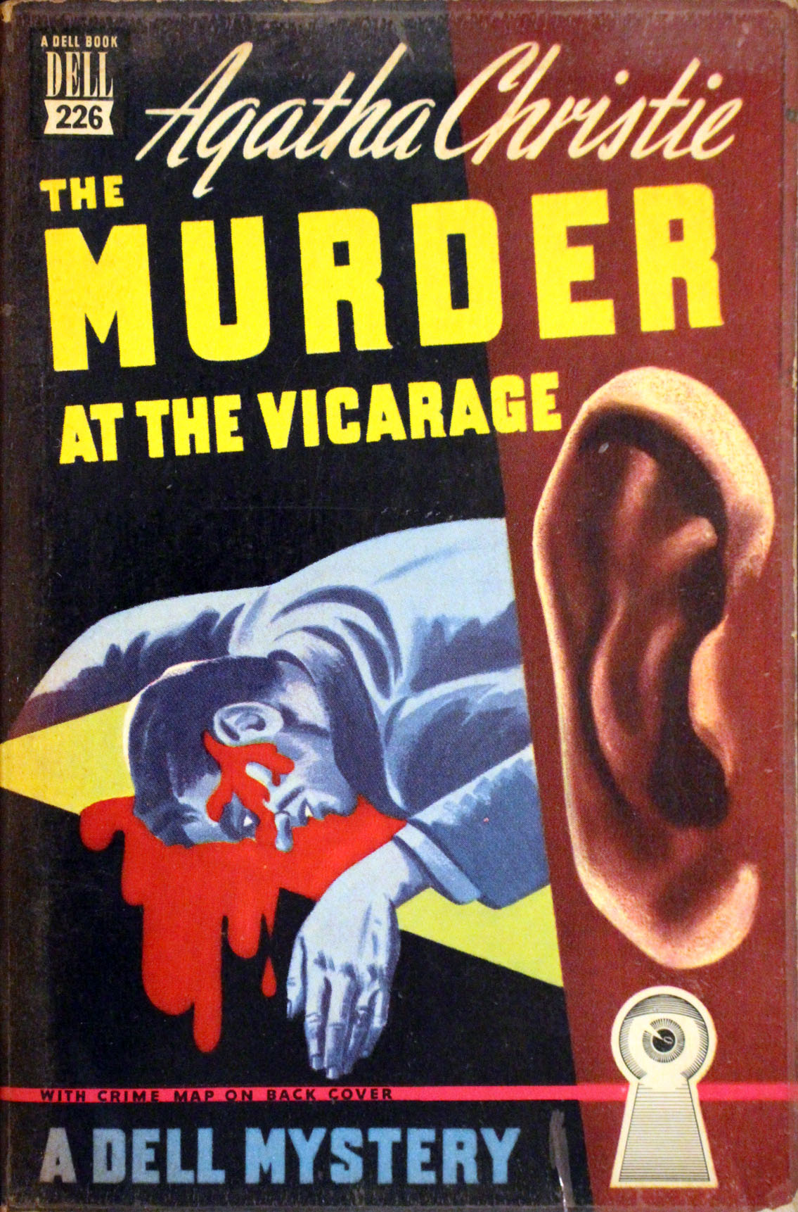
That same year (1948) a US mapback edition was published by Dell, the now vintage and highly collectible paperbacks with maps on the back covers. This cover has some style to it, with interesting fonts and some artwork that actually relates to the plot – a giant listening ear and a portrait of the murder victim. It’s a little sensational but it’s the first cover that seems to relate to the story. This is now 18 years after first publication.
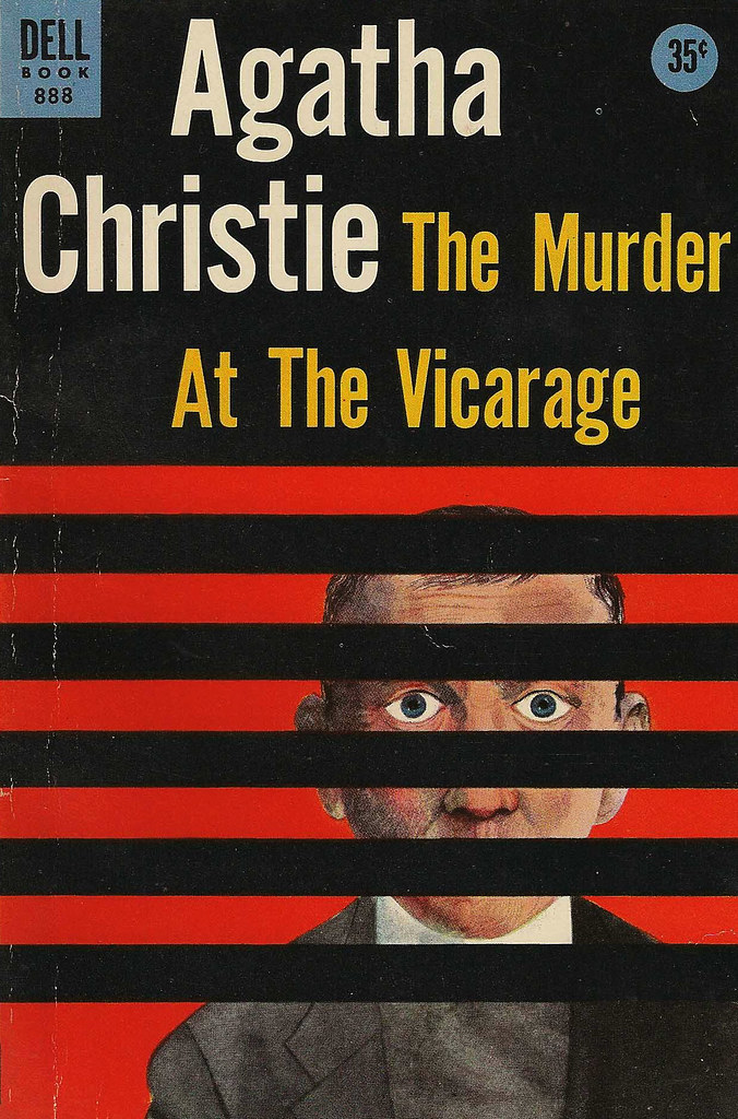 In 1956, talented designer and artist Milton Glaser put his mind to the cover, resulting in one of my favorite covers in the series. It’s a strong, modern design of the vicar peering through the slats of his window blind. Whether or not the blind fits the 1930’s is almost irrelevant, the design is so excellent. This is a Dell paperback, and the first cover where Christie’s name is on top of the title, as well as in a larger font than the title, indicating her growing popularity as a brand.
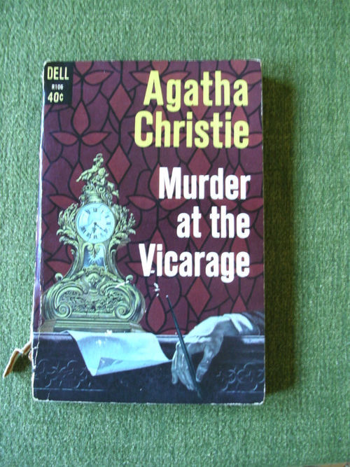
In 1961 there’s another Dell paperback, also with a fair amount of interpretive artwork on the cover. Christie’s name is again on the top though the font is the same size. The artwork here is more quotidian, but it’s still a pleasant cover that conveys a feel for the book.
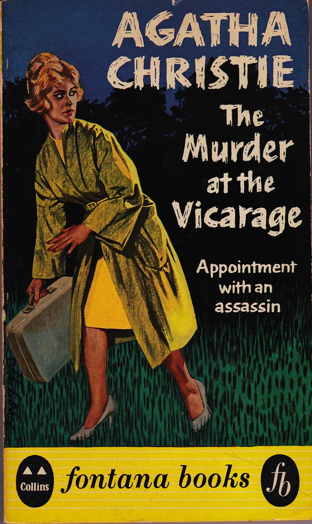
The UK 1961 paperback is far different. When I was in college, I spent a lot of time in the costume shop at the theater and one of our pet peeves was the inappropriate zipper – for example, in a Western, if a woman has a zipper on the back of her dress – well, it’s just not period. This UK cover has a similar problem: the woman in the illustration has a very 1960’s outfit on. The cover, with the text “Appointment with an assassin” makes this charming village puzzle mystery seem like a suspense novel. It’s a reframing for sure, and I actually like this cover, it just doesn’t have much to do with the actual book.
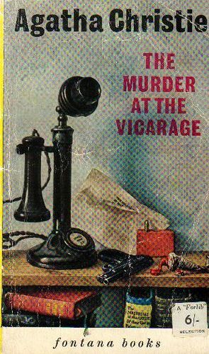
 In 1963 comes the first Tom Adams cover. Tom Adams, for those unfamiliar, took on Christie as a fully interpretive art project. He designed wraparound covers for Pocket in the US and straight covers for Fontana in the UK. His first almost traditional still life cover for Vicarage is simply a phone, a gun, a tube of paint and a bookshelf. According to the website Beautiful Books, the tube of paint is an authentic 1930’s tube owned by the artist’s grandfather.
His next cover (he often did 2 or 3 for the same book) comes in 1968 and is another favorite of mine, embracing Adams’ surrealist style. It shows a vicar with a tennis racket for a head. Again, Adams did his research and used the Dunlop archives to portray a period silhouette for the racket. For more on Adams and his covers I recommend the Beautiful books website https://beautifulbooks.info/illustratedbibliographies/illustrators-and-authors/collecting-tom-adams-agatha-christie/. It’s completely fascinating and eye opening.
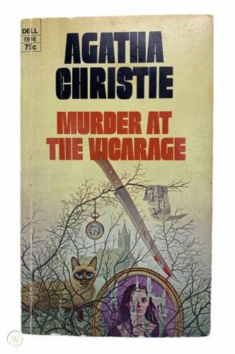 In 1970, a Dell paperback cover is very 70’s, with an almost Night Gallery style creepy cover, including a sinister cat, a slashed portrait that seems lifted from a 70’s TV set, along with a requisite bloody knife. Agatha’s name stays above the title in a large font.
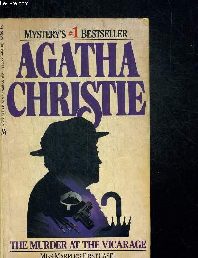
In 1984 – 54 years after publication – comes a slightly quotidian cover from Berkley but with an actual portrayal of Miss Marple! Christie’s name is in a huge font, and under the title, it’s noted as Marple’s first case. For this reason I include this fairly ordinary cover. A publisher was acknowledging Marple’s importance (another entire essay).
In 1993 comes a nice UK Harper Collins edition, a tie in to the Geraldine McEwan ITV production. It’s an excellent cover, truly reflecting the novel (as well as the excellent TV production).
And finally, there’s a 2016 cover from a William Morrow re-issue of hardcover editions. It’s very traditional with a gravestone, large Agatha Christie font, and a subdued color palette. It seems like nothing special, but it certainly is a further cementing of Christie as a brand. What’s next for the Queen of Crime? Look forward to new cover art for this eternal genius storyteller.